
In December 2019, I met Brian Liscio who was working on a complete overhaul of his dating platform, Fantasy FINDR. The new direction would be called Knections; a location-based dating service for Android and iOS. He was looking for someone to help rebrand his company and build a new user experience for the product.
Project Length: December 2019 - December 2020
Project Role: Lead Product Designer
Initial Steps and User Persona Generation:
Knections was the new direction of the Fantasy FINDR dating application. Knections needed an official brand strategy and a rethought application that would make forming connections between humans easier.
I performed an initial heuristic evaluation across the current Fantasy FINDR application only to find countless violations to the 10 common usability heuristics. As the company and app were going through a complete shift in image and application strategy, making improvements to the app as it stood was already something we were not considering, so designing the application from the ground up to avoid usability issues in the first place was chosen as the strategy going forward

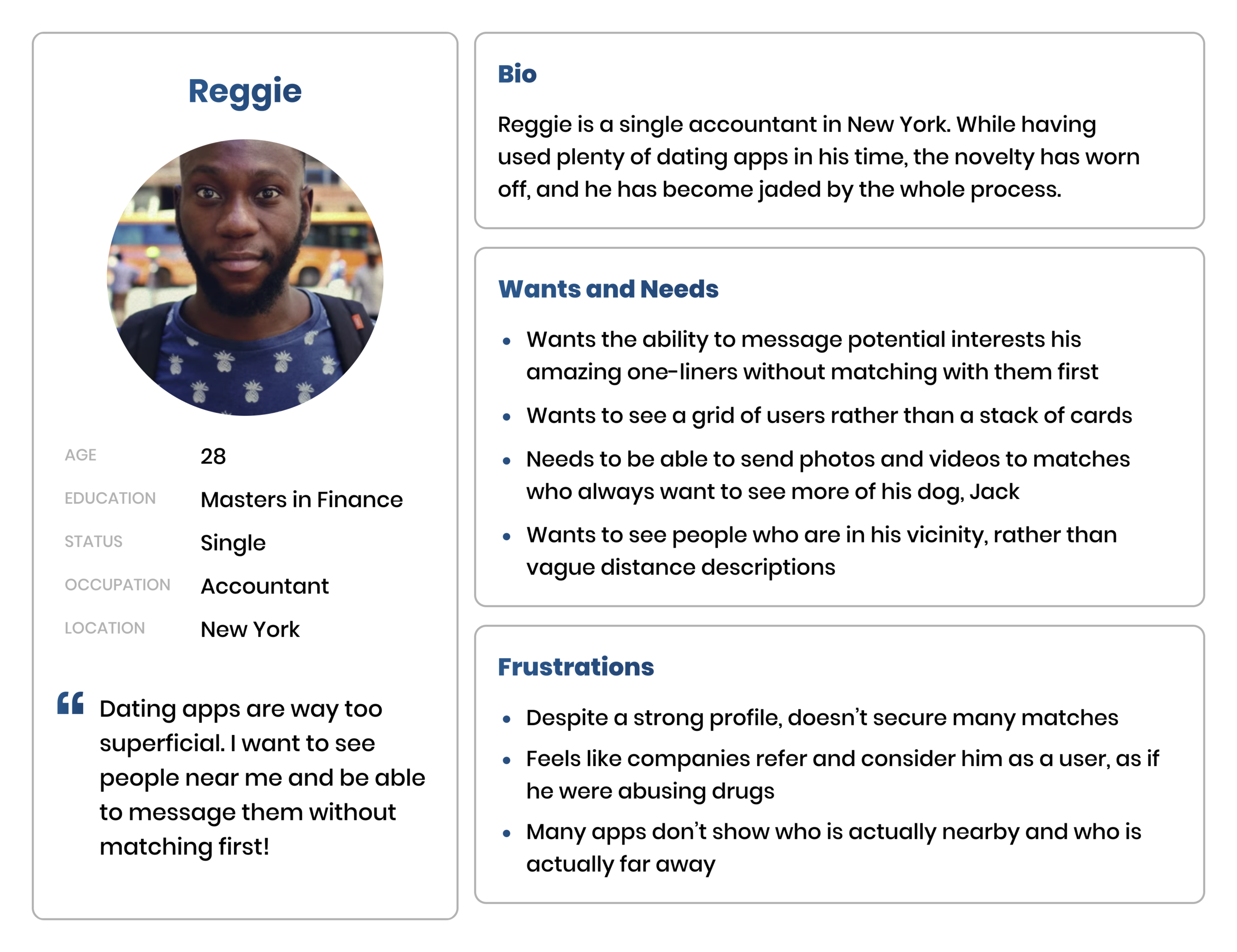
Additionally, I conducted several user surveys with a few individuals I knew who were frequent dating app users, to understand a little bit better how they felt about the current app scene. From these surveys, I was able to generate two user personas that we would keep in mind throughout the development of Knections.
Phase One: Company Rebrand

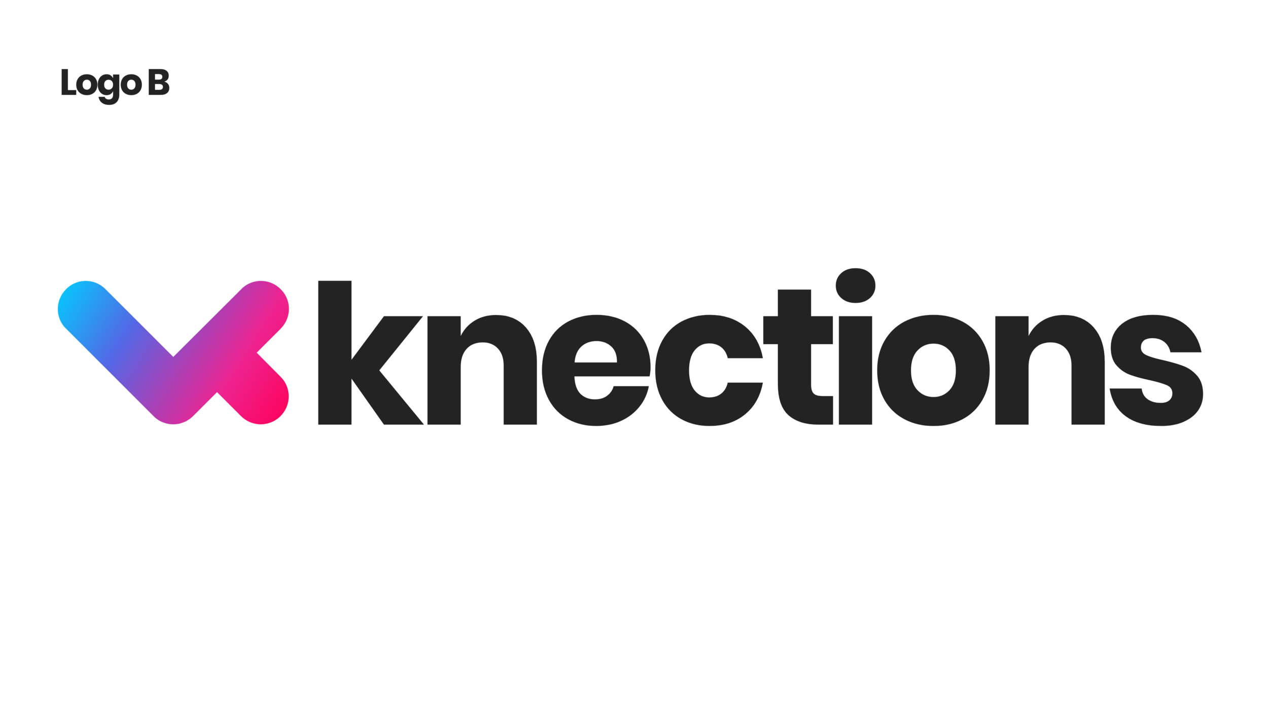
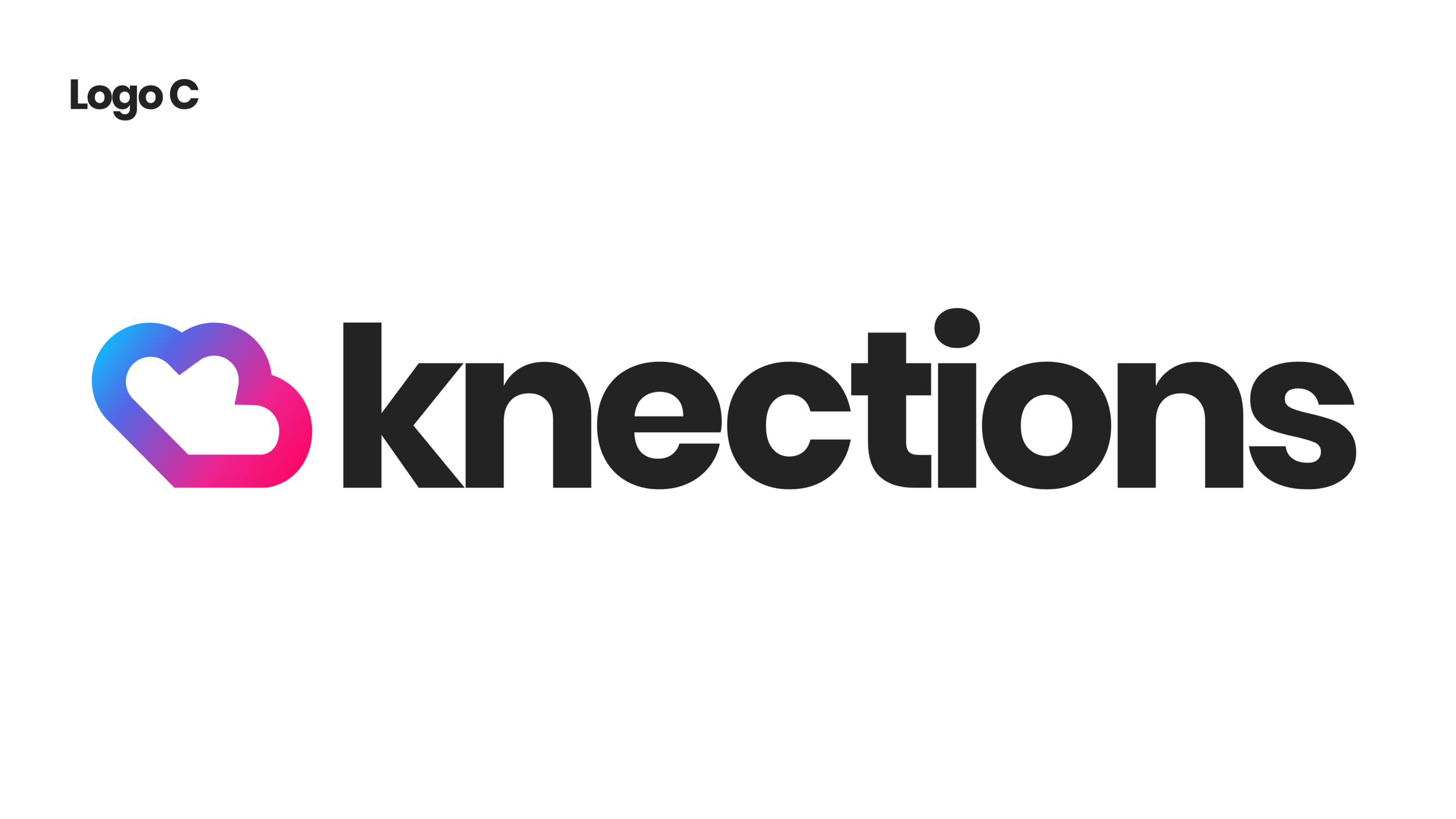
I began with some initial sketchwork on logo concepts. We ended up honing in on four possible logomarks that felt representative of the concepts of connecting, joining together, intersection, and paths crossing, which was intentionally considered to reinforce the name of the company and future application. They also were designed to reference the shape K, since that was such a distinguishing characteristic of our name.
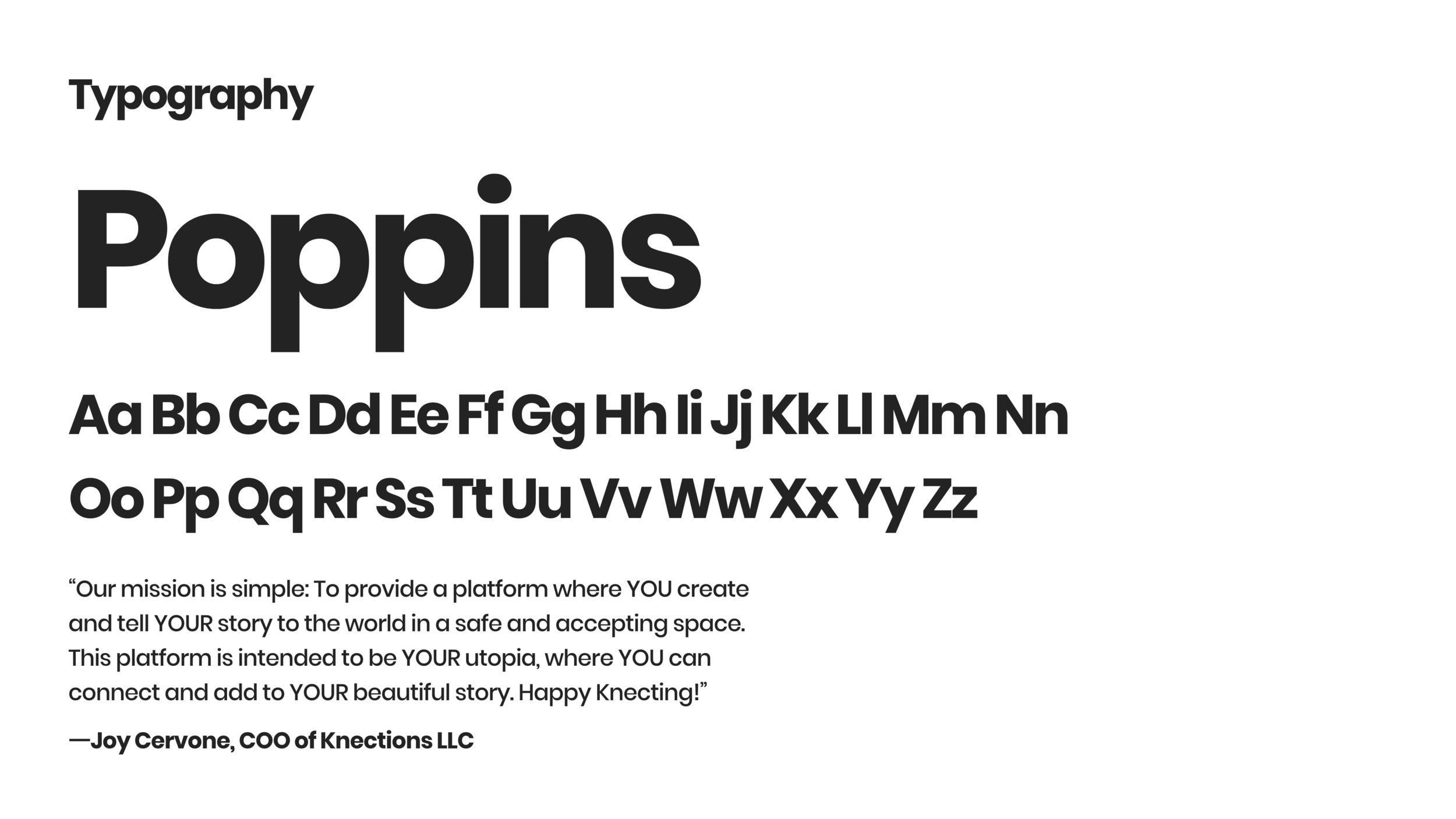
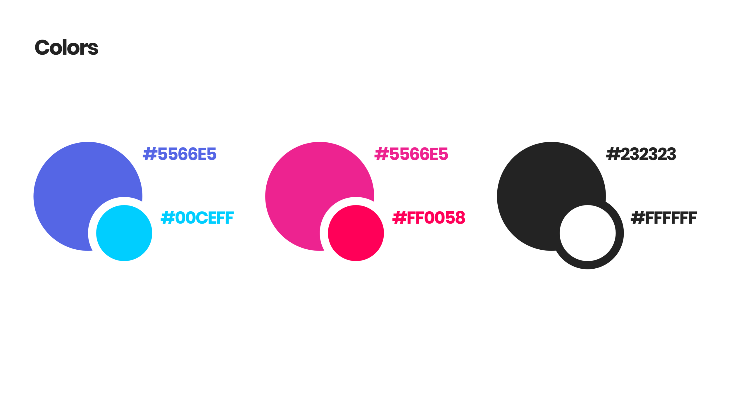
I paired these logomarks with the Poppins typeface and a light blue and pink color scheme to begin to think about how these elements could stack up to the competition from the likes of Tinder, Bumble, Hinge, HUD, Pure, and Grindr, to name a few popular dating applications.
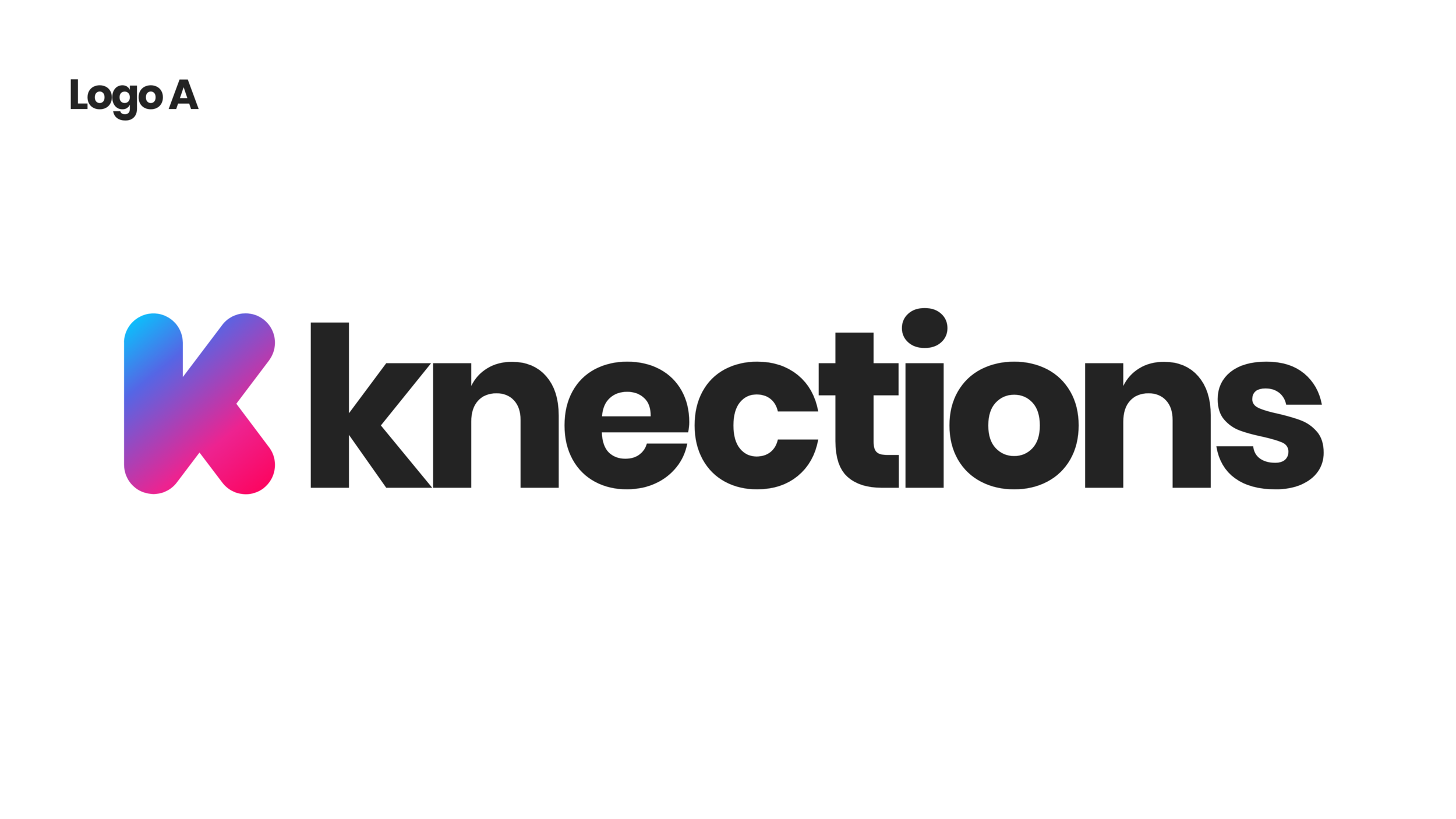
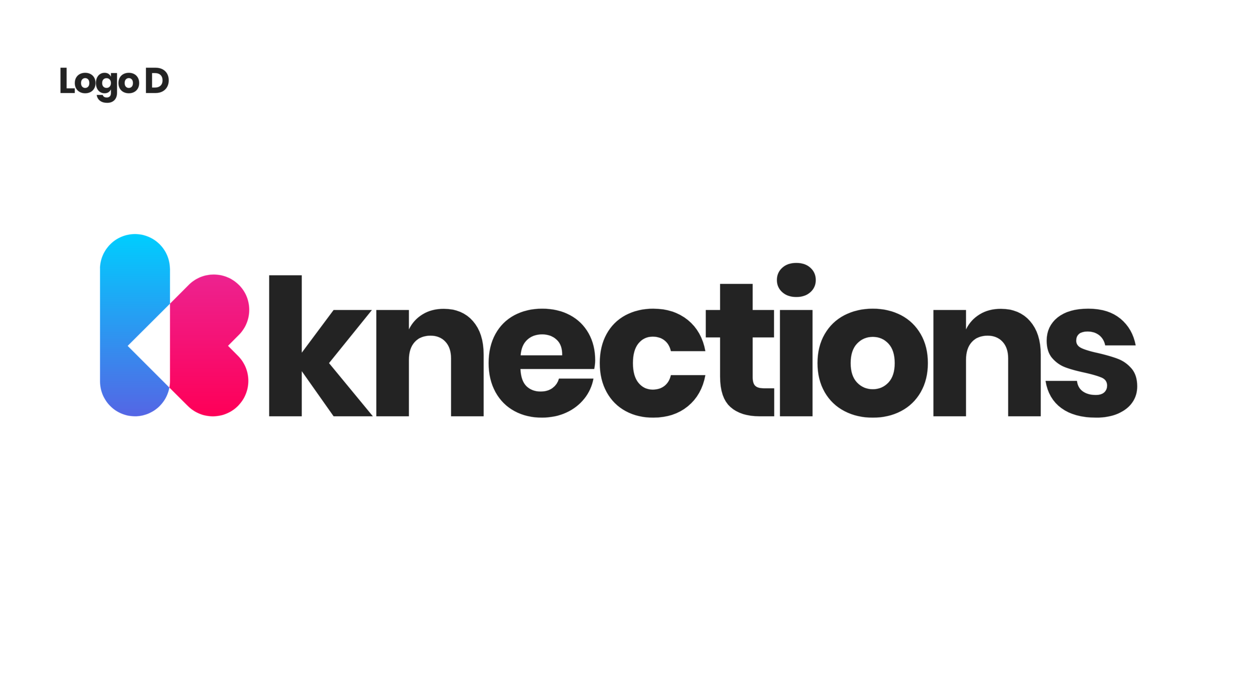
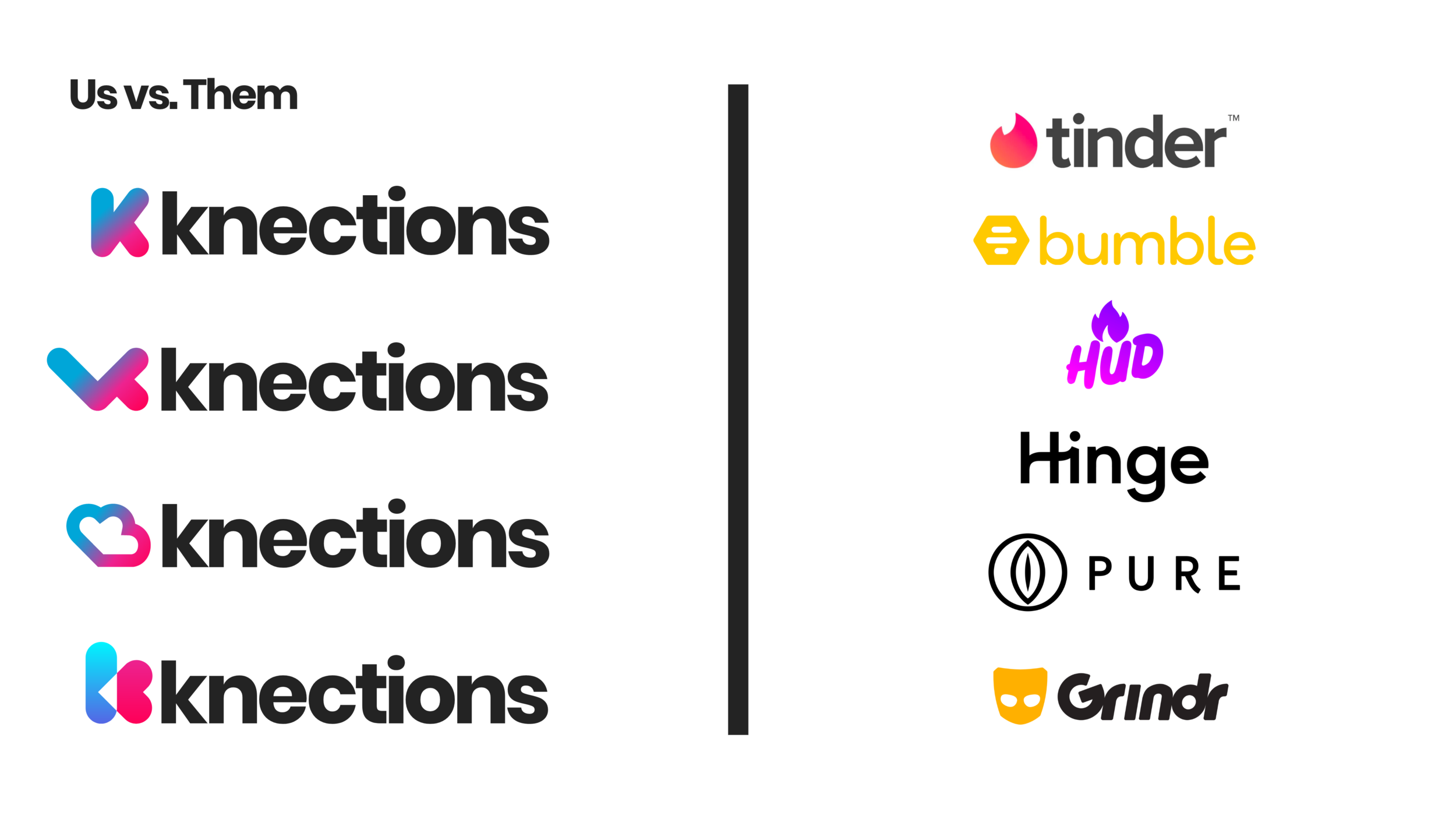
After some discussion workshops, we agreed to proceed with the following logo. It featured an abstracted K shape that also doubled as two hearts coming together. That feeling might evoke a sensation of being on cloud-nine, which eventually would become the official nickname for the logomark shape- “the Knections cloud”
A few weeks later during the beginning stages of asset handoff to Dustin our developer, I refined the logo once more to feature a more robust gradient (with a third orange color introduced, as well as a capitalized K.)
Phase Two: Information Architecture
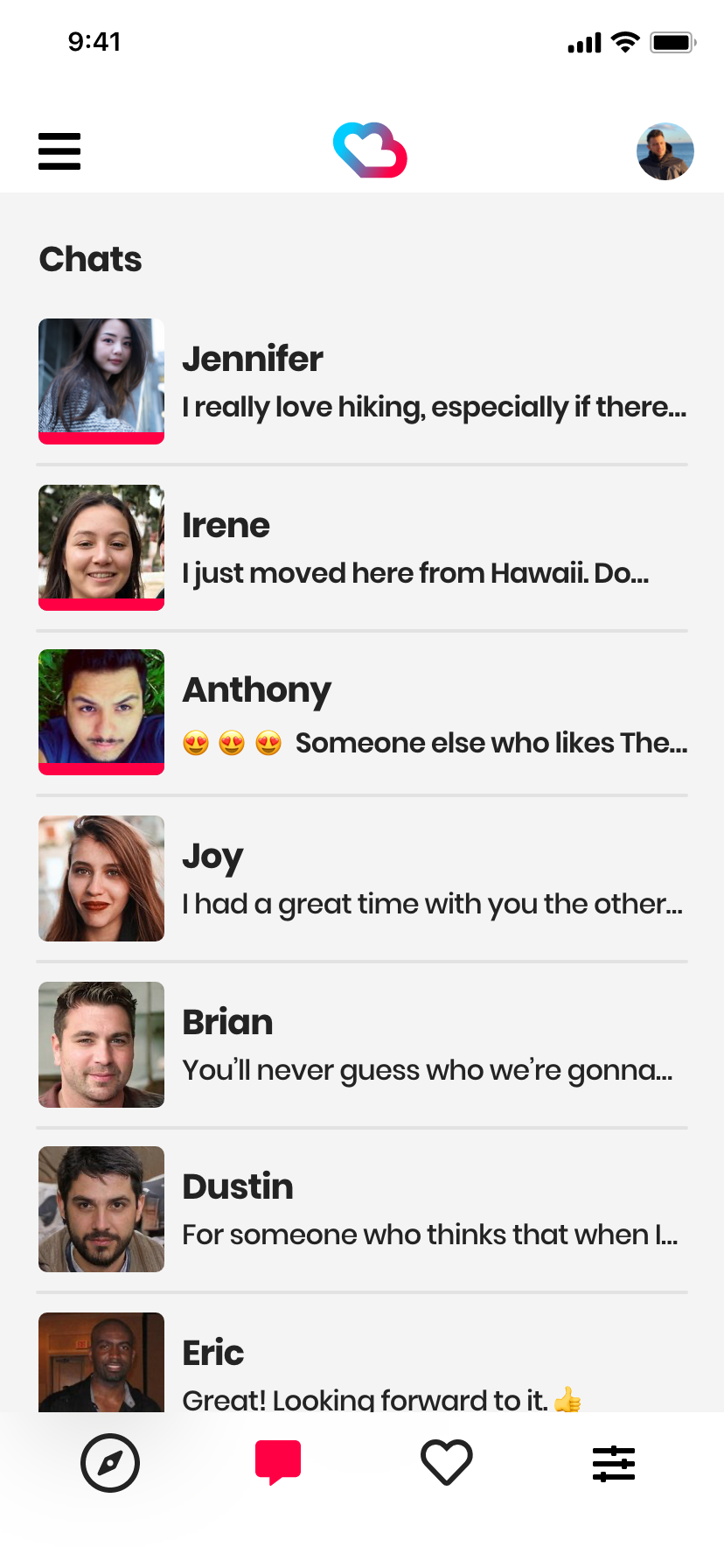
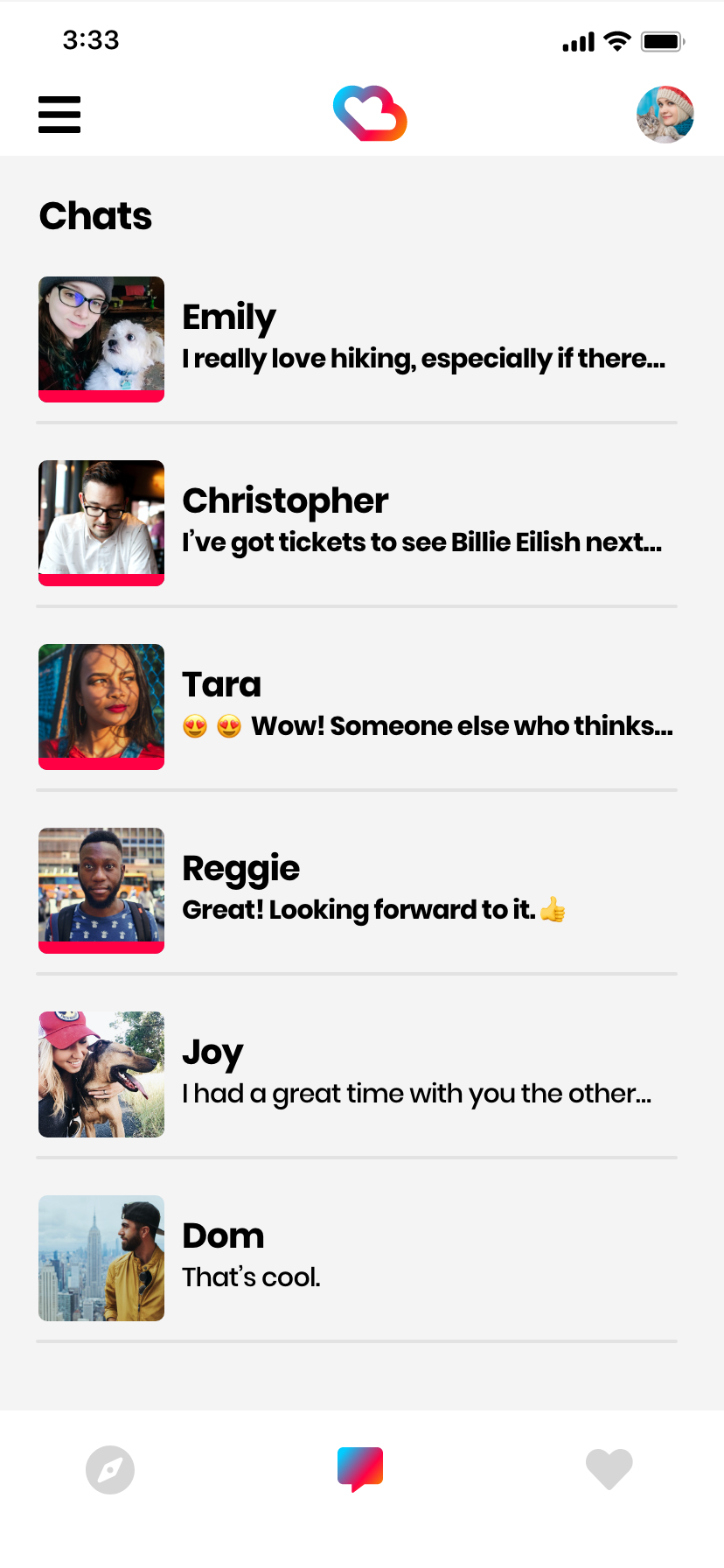
One of Fantasy Findr’s biggest flaws was that it featured a very confusing information architecture structure. Navigating the app took many taps to get to basic functionality such as messaging others or , and structurally combined features such as Messages and Favorites onto single-page layouts without consideration as to if this were in the best interest of the user.
Before beginning to sketch out initial sketches and wireframes, a feature assessment was conducted and a revised information architecture map was constructed.

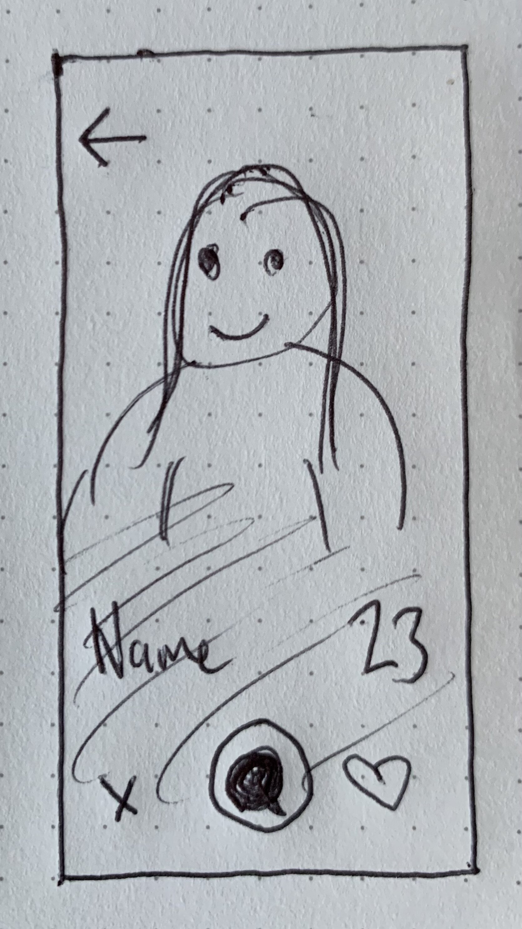
Phase Three: Preliminary Sketches
As with any project, it is important to begin starting down by sketching with a pen and paper. I sketched out preliminary ideas for every page from the information architecture map to get the basic structure down for every screen that I was about to create for the app, which may include more screens than the IA map scopes out.
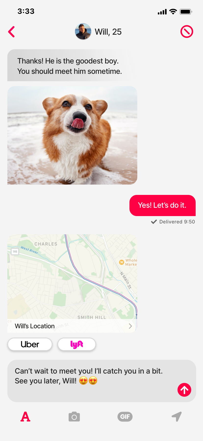
Six of the most critical screens are depicted below, as well as their progression from initial sketches to final development handoff, in order to demonstrate how much and little an app can change over the course of the design process.


Phase Four: Digital Wireframes
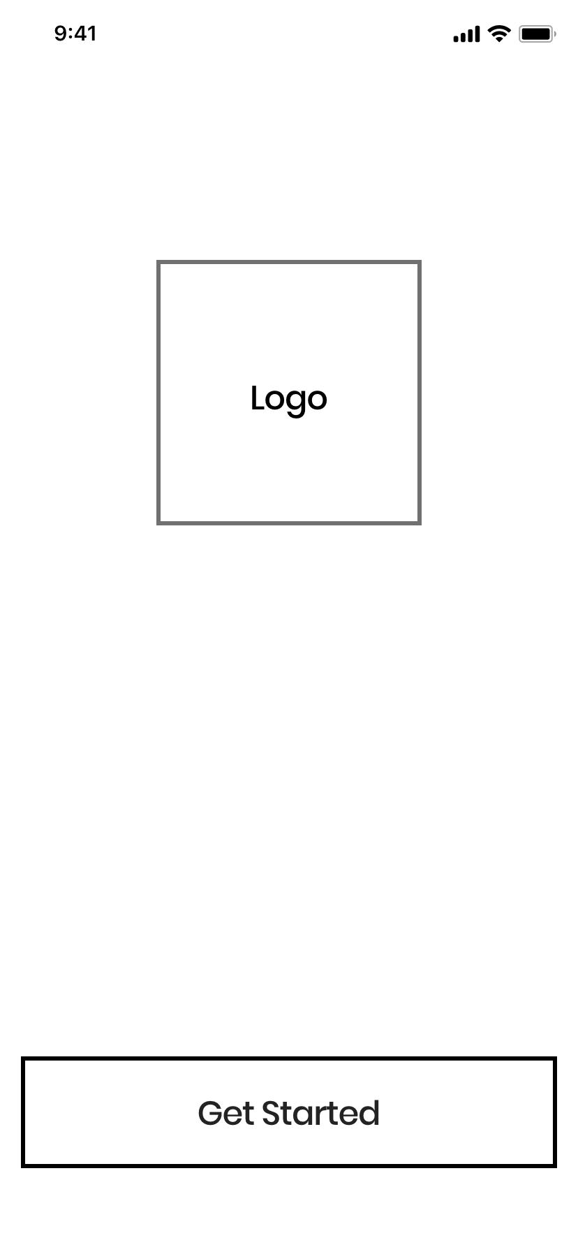
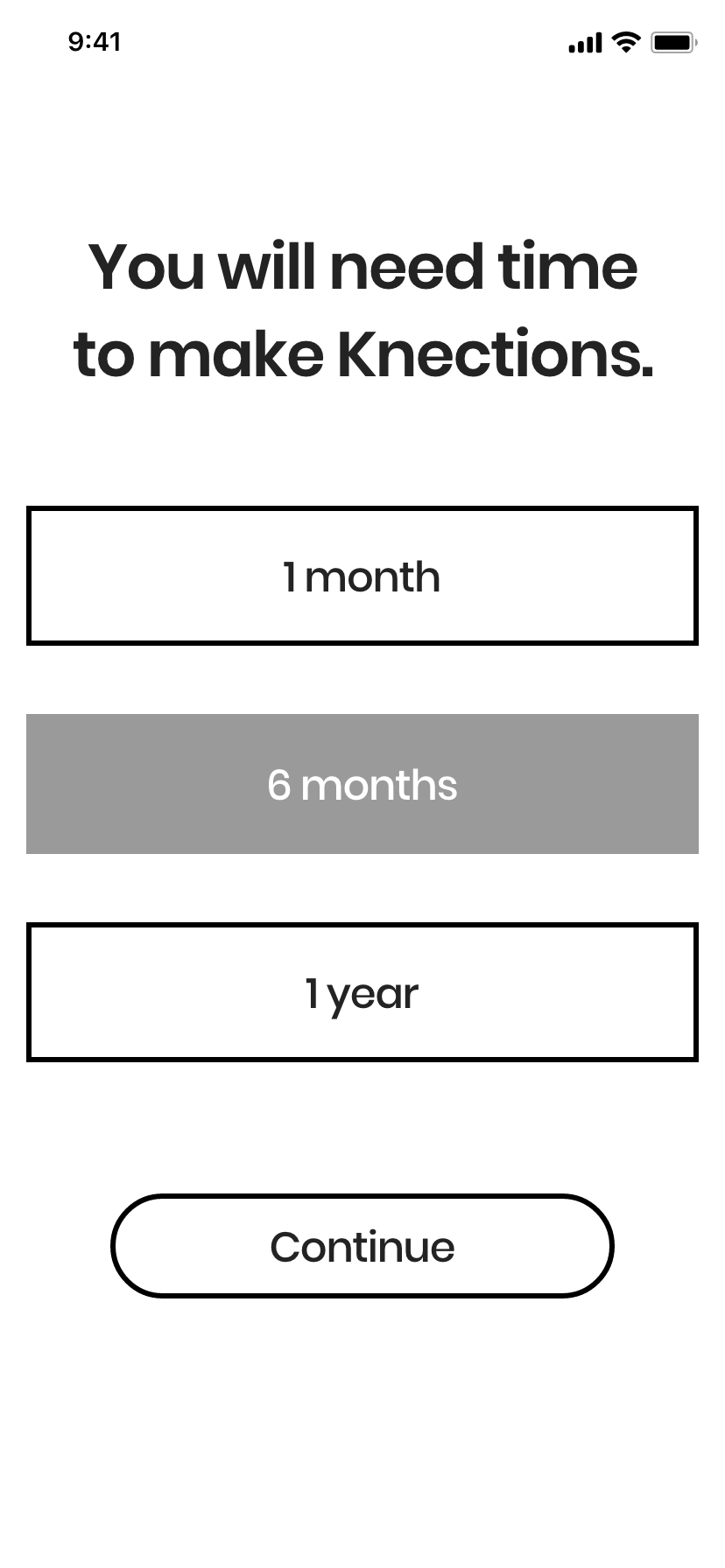
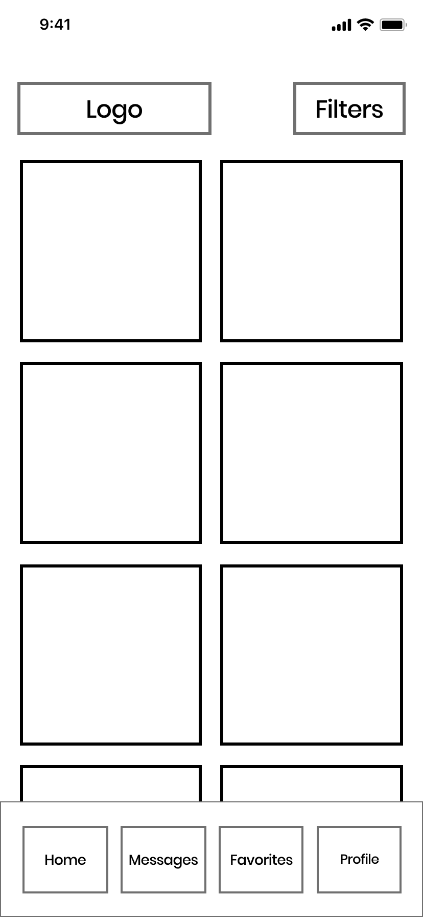


Phase Five: Low Fidelity Prototype
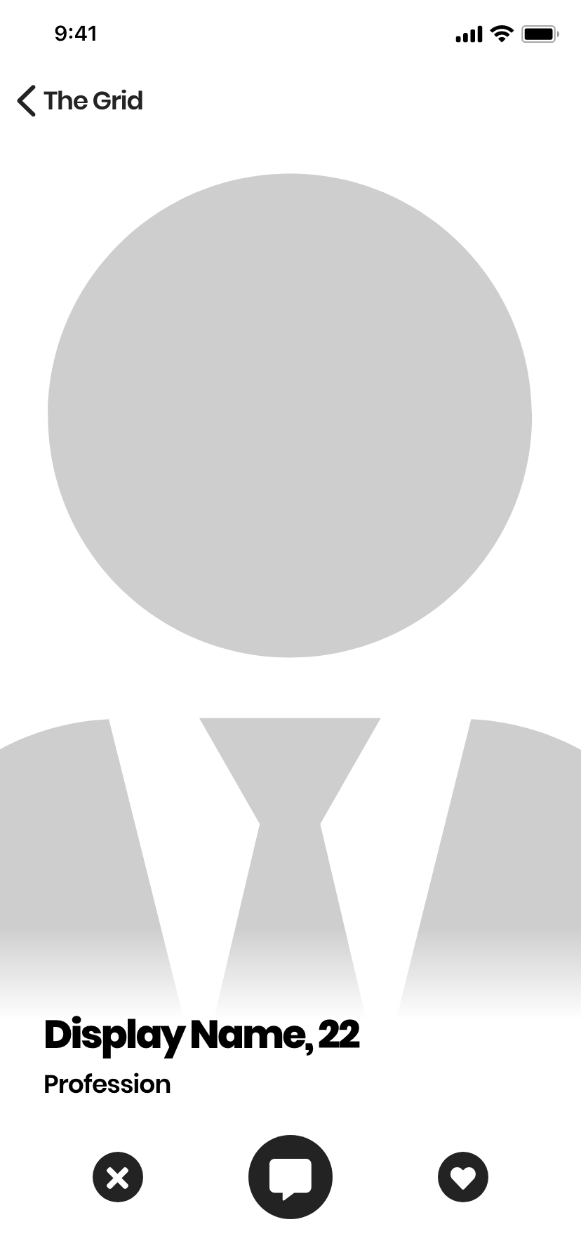
The low fidelity prototype brought the digital wireframes to the next stage, with a different consideration for text treatment, grid style, and the profile.


Phase Six: Mid Fidelity Prototype
The mid fidelity prototype was where a real exploration of the recently-finished Knections brand identity occured, and introduced real photos, color treatments, and refined typography.


Phase Seven: High Fidelity Prototype
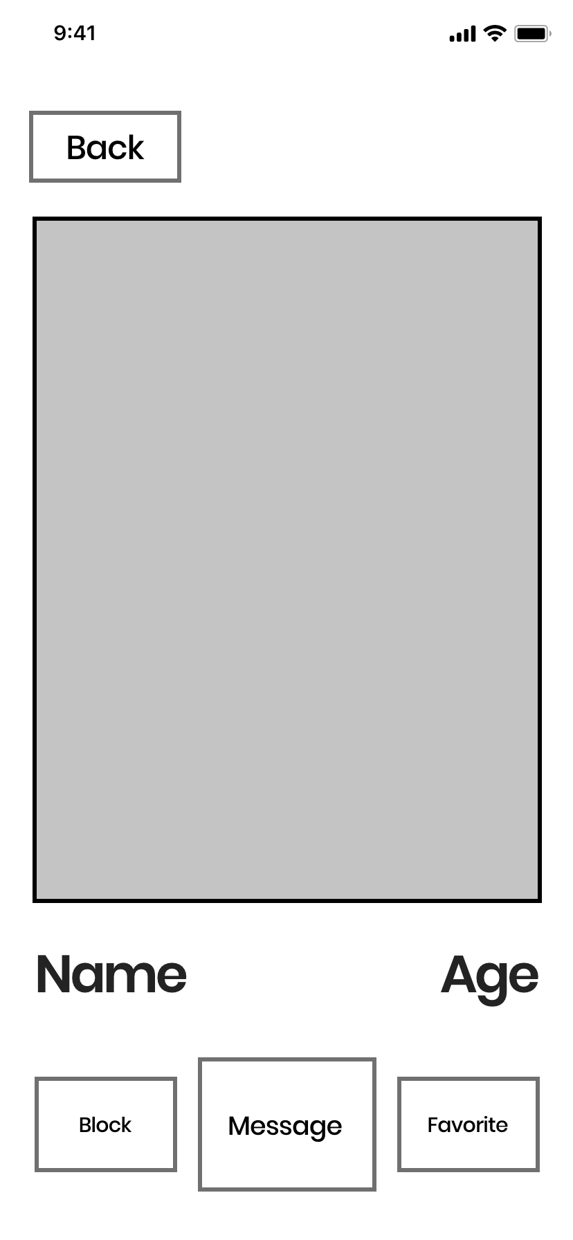
At this point, the Knections app was feeling extremely refined, with increased attention to details, especially on the profile and grid pages. The grid noticably went back to a more elongated aspect ratio, so as to better highlight user’s photos. Accessing your profile would now be done from the top navigation bar, the filters button was relocated to be on the grid itself, which made more contextual sense, and numerous other tweaks and changes to the experience of the app to make it a breeze to navigate.


Phase Eight: Freeze Document / Handoff Version
Phase ten was done after a short break from the iterative design process. This version was my last chance to ensure everything was in perfect shape, so handoff to development would be quick and easy, and no future changes would need to be made until post-release (or any hiccups along the development process, of which there were a few)
I stripped back the use of the gradient to be more considered in its use. The grid was once again refined to include a taller and less complex profile card design; the top and bottom navigation bars would be colored to match the background, creating a clean and seamless look across the app; the favorites were reworked to be scrolled horizontally instead of paginated between two tabs.
The profile received the biggest change, moving away from a full-page photo design with a details card overlaid, to a single-page (two-pages if the user had a partner attached to their profile, indicated via a tab bar) that itself would scroll.


Phase Nine: Website Design, Mockup Creation, and Social Media Advertisements

While we were in Phase Nine, I began designing content for the Knections website, which included a Coming Soon teaser page, a home page, an about page, a community guidelines & safety tips pages, as well as a contact us page. You can visit www.kections.com to explore the entire website and mockups of the Knections app.
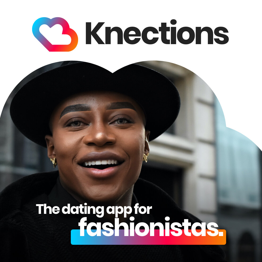
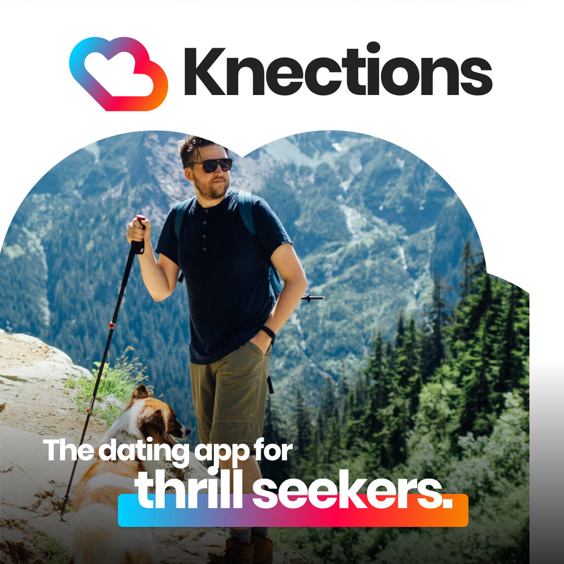
We also had to begin updating our social media accounts, so I generated a series of advertisements featuring happy couples (some of whom were actually friends of mine and agreed to let me use some of their favorite photos as part of our content strategy.)
Anticipating the possibility of future targeted ads, attention was paid to creating copy that could be repurposed to target a broad audience, or down to extremely targeted, such as lobster lovers or gamers. The resulting ads were able to be generated quickly and easily.


Phase Ten: Pre-Launch Campaign


While I was working directly with Dustin on making sure that elements and assets were applied correctly during development, our pre-launch campaign was starting to ramp up. As we were approaching our April 1st release, we began our Instagram campaign on the @knections account, which has an audience of over 45,000 followers. This would be a great chance to reintroduce the brand as well as give everyone something to laugh about, especially as the COVID-19 outbreak was increasing in severity across the world.
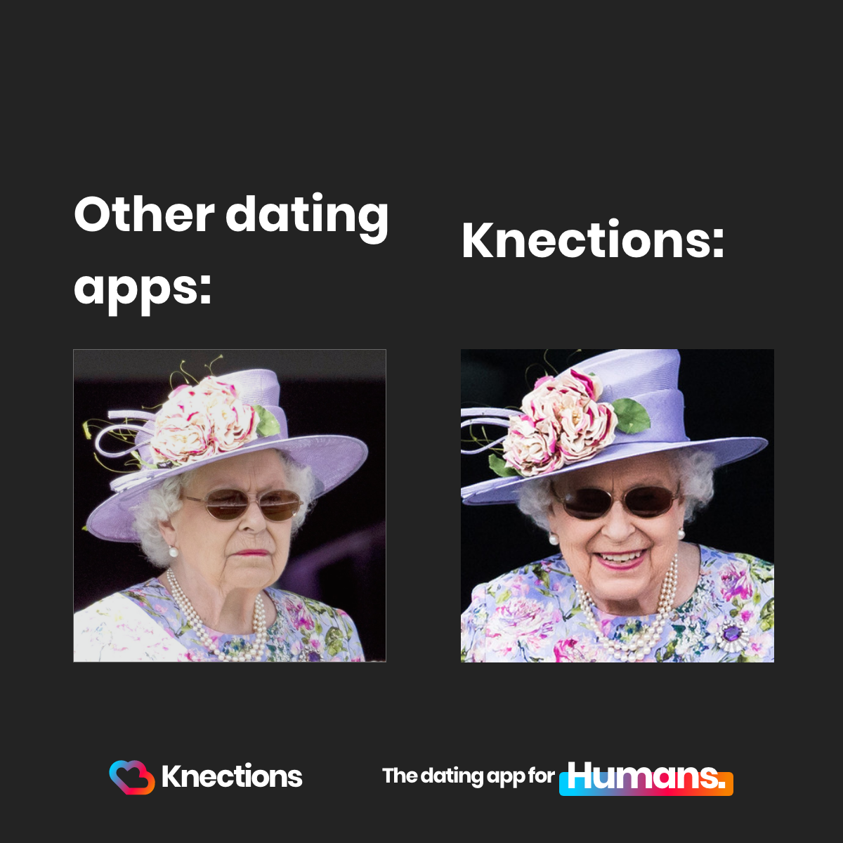
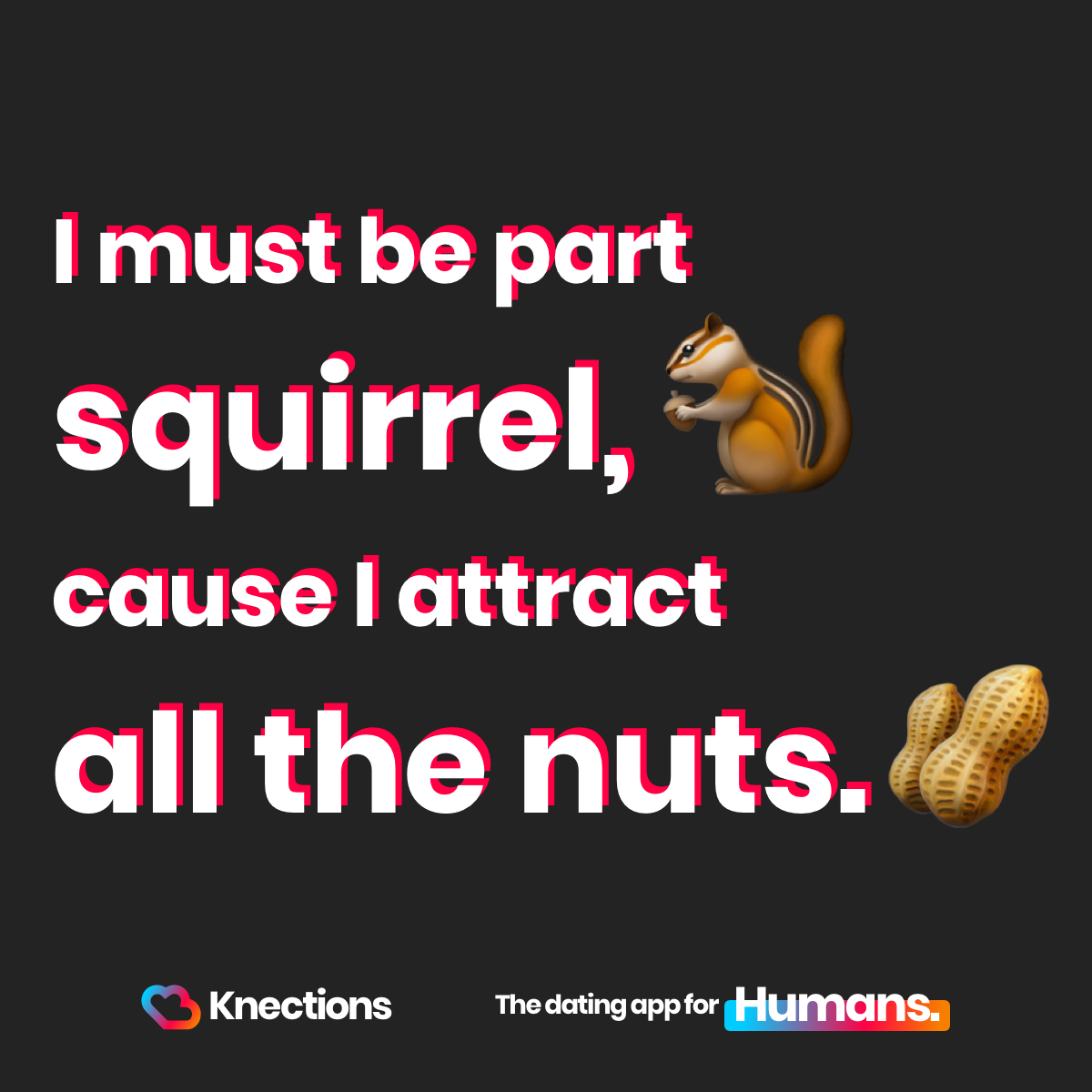
We created a template to display quotes, memes, and other graphics, and posted at peak hours throughout the day. I searched for and collected dating-related memes and integrated the Knections brand to them. We observed an increase in engagements, both with our website as well as other social media accounts. This allowed us to also measure which types of content generated the most engagement:
The Office memes. Being Single memes. Empowering statements.
Phase Eleven: App Store Banner Photos
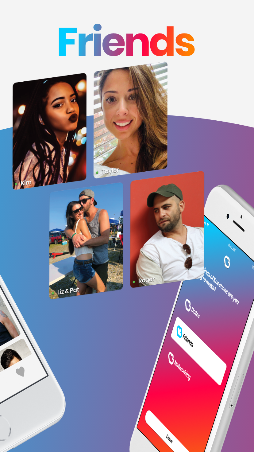
As development continued and the app was pushed to our Testflight Developer Accounts for beta testing, I would work directly with Brian to create the banner images that our app would have in the App Store. This was perhaps the most critical design phase I worked on, as these banners would be the face for the app and represented the make-or-break moment: will potential customers find our app engaging enough to stop scrolling and investigate further?
We cut right to the chase in our banner photos. Date. Friends. Networking. The First App for Humans, not Users. Available in 147+ countries & 32 languages. Start making Knections.
The banner images and thus the app itself had to be scaled to all required iOS devices as per Apple’s Developer Program, but the result was an app store banner series that was full of motion and vibrancy.
iPhone X


iPhone 6, 7, 8


iPad Pro


iPad 10.5


Phase Twelve: App Store Preview Video
Apps that feature preview videos are an almost surefire way to guarantee increased engagement and downloads, so I created a 30 second app store preview video, also for all required device sizes, but depicted here is the iPhone X video.
